The Power of Visualization: Why Seeing Your Spending in Charts Changes Your Habits
You already know you spend too much on food delivery.
You know this because you feel it at the end of every month — the vague unease when you check your bank balance and find it lower than it should be given how careful you thought you were being.
You know it the way you know you should exercise more, sleep earlier, and call your parents regularly. Knowing has not changed anything.
Here is what will:
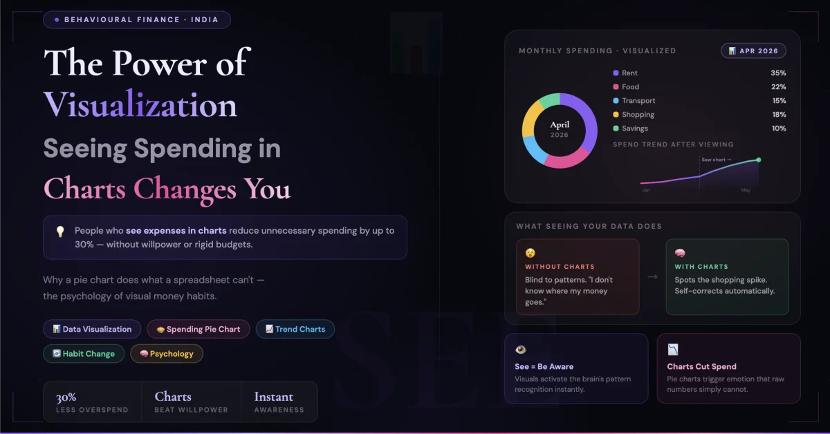
Seeing a chart that shows your food delivery spend as a bright orange slice consuming 31% of your total monthly discretionary budget — sitting right next to a grey slice labelled "Investments: 8%."
The moment you see that chart, something shifts that no spreadsheet row or bank statement ever triggered. You cannot unsee it. And because you cannot unsee it, you cannot continue the same behaviour with the same comfortable unawareness.
This is not a motivational claim. It is cognitive science — and it has profound implications for how you should be managing your money.
Why Numbers in a List Don't Change Behaviour
Your bank statement is a complete record of your financial life. Every transaction, every amount, every merchant — it's all there, updated in real time, perfectly accurate.
And yet almost nobody's financial behaviour has been transformed by reading their bank statement.
The reason is fundamental to how the human brain processes information.
When you look at a column of numbers, your brain activates its analytical processing system — the slow, deliberate, language-based part of your cognition that processes one piece of information at a time. Reading ₹347 on January 3rd, ₹892 on January 7th, ₹124 on January 9th — your brain processes these as individual, disconnected data points.
To extract meaning from these numbers — to understand that they represent a total of ₹4,700 spent on food delivery that month, which is 28% of your take-home salary — requires mental work. Addition, division, comparison, context-setting. Your brain must do this work voluntarily, actively, deliberately.
Most people don't do this work. Not because they are lazy — but because the brain conserves energy by defaulting to the path of least cognitive resistance. A list of numbers offers no shortcut. The brain skips it.
A chart is different.
When you look at a pie chart showing food delivery as 28% of your spending, your brain activates its visual processing system — the fast, pattern-recognizing, emotionally connected part of your cognition that evolved over millions of years to extract meaning from what it sees instantly.
You don't calculate that 28%. You see it. The orange slice is large. The investment slice is small. The relationship between them is immediate, emotional, and impossible to rationalize away.
Numbers require interpretation. Charts deliver meaning directly.
The Three Moments When Visualization Changes Everything
There are three specific psychological moments where seeing spending in visual form creates behavioural change that numbers alone never could.
Moment 1 — The Recognition Shock
Most people carry a mental estimate of what they spend on different categories. These estimates are almost universally wrong — and wrong in a specific direction. People consistently underestimate their spending on small, frequent, pleasurable purchases (food, coffee, snacks, impulse buys) and overestimate their spending on large, visible, memorable ones (rent, EMIs, utility bills).
This is because the brain uses emotional salience, not mathematical frequency, to estimate spending. Signing a ₹15,000 rent cheque is emotionally significant — it feels heavy. Scanning ₹80 on Zomato eight times a month is emotionally light — each scan feels trivial. The brain stores the rent as "a lot of money spent" and the Zomato scans as "barely anything."
The mathematical reality: ₹15,000 rent vs ₹640 Zomato. The felt reality: rent feels much larger and Zomato feels negligible.
When a pie chart appears showing your actual food delivery spend — the visual representation bypasses the brain's emotional distortion and delivers the mathematical reality in a format the emotional brain can process.
This is the recognition shock moment: "I spend that much on that?"
It is uncomfortable. It is supposed to be. Discomfort is what precedes change.
Moment 2 — The Comparison Clarity
Knowing you spent ₹4,200 on dining out last month is moderately useful information. Seeing a bar chart showing you spent ₹4,200 on dining out and ₹1,800 on investments — side by side, same scale, same month — is a completely different experience.
The comparison is immediate. The dining bar is more than double the investment bar. You don't need to calculate this. You see it in the half-second your eyes take to scan the chart.
And once you've seen that relationship — once your brain has registered the visual disproportion between what you spend on pleasure today and what you invest for tomorrow — you have a reference point that travels with you into your next dining decision.
You're at a restaurant. The bill arrives. It's ₹1,800 for two. In the absence of visualization, this is just a number. With the chart in your recent memory, this ₹1,800 is immediately anchored: "That's the same as my entire last month's investment."
You don't necessarily not pay it. But you pay it consciously — with full awareness of what it represents relative to your other priorities. Conscious spending is fundamentally different from unconscious spending even when the rupee amount is identical.
Moment 3 — The Trend Revelation
This is the most powerful moment — and the one that drives lasting change rather than momentary guilt.
A pie chart shows you one month. A trend line shows you six months. And the trend line reveals something that no individual month can show: the direction of your financial life.
When you see a line chart of your monthly savings rate over six months — and the line is trending downward — you are seeing your future. Not abstractly, not theoretically — visually, unmistakably, in the language your brain evolved to respond to: a direction in space.
A downward trend line triggers the same neurological response as seeing a slope you are sliding down. It activates urgency. It creates the felt sense that something must be done — not "eventually," not "when I have more income," but now.
Conversely, a trend line of your food delivery spend declining over three months — because you saw the pie chart, felt the recognition shock, and made a small change — is among the most motivating things a person trying to build better financial habits can experience.
Progress visualized is progress reinforced. The brain's reward system responds to seeing improvement with the same neurological satisfaction as experiencing it directly.
The Categories That Always Surprise People
After working with thousands of Indian household budgets, certain patterns emerge with remarkable consistency. These are the expense categories that virtually every person underestimates until they see them in a chart — and that virtually every person changes their behaviour around once they have seen them:
Food delivery and dining out combined: Most urban Indian households mentally budget ₹2,000–₹3,000 for this category. The actual combined number is typically ₹5,000–₹9,000 — because dining out and home delivery are mentally tracked separately and both are underestimated. The chart combines them. The combined number is always a shock.
Subscriptions — the invisible creep: Netflix. Hotstar. Spotify. Amazon Prime. YouTube Premium. ZEE5. Trading platform subscription. News app. Cloud storage. Most households have 8–14 active digital subscriptions. Most people estimate 3–4. A bar chart showing the monthly subscription total — typically ₹1,500–₹3,500 — against the conscious estimate creates immediate action. Subscriptions are cancelled on the same day the chart is seen in almost every case. No other intervention produces subscription cancellation as reliably as visual representation.
Transport — the invisible accumulation: The daily auto. The occasional Ola. The weekend cab. The petrol fill-up. Each feels minor. A monthly transport bar often reveals ₹4,000–₹7,000 in spending that was mentally estimated at ₹1,500–₹2,000. Seeing the bar creates immediate reassessment of transport decisions — metro instead of cab, batching errands instead of multiple trips, carpooling.
Miscellaneous — the budget black hole: Everything that doesn't fit a category. The birthday gift. The household item. The pharmacy run. The neighbourhood fair. Individually: trivial. Monthly aggregate: ₹2,000–₹5,000 that appears as a budget mystery every single month. The chart doesn't solve the mystery — but it reveals its scale, which is the prerequisite for any attempt at solution.
Why Willpower Fails and Visualization Doesn't
Every financial advice article eventually recommends willpower. "Just stop ordering food delivery so often." "Make a budget and stick to it." "Be more mindful about your spending."
This advice fails not because the person receiving it lacks discipline — but because willpower is a finite resource that depletes through the day and is weakest precisely at the moments when spending decisions are made.
You make your Swiggy order at 8pm after a full day of work decisions, social decisions, and commuting stress. Your willpower is at its lowest point. The friction of making yourself not order when you're tired, hungry, and accustomed to the convenience is enormous.
Visualization doesn't work through willpower. It works through identity.
When you have seen the chart — when the image of that orange slice and that tiny investment sliver is part of your mental landscape — you carry a piece of your financial identity into every spending decision. Not as a rule ("I should not spend on food delivery") but as a self-concept ("I am someone who overspends on food delivery and I have decided I don't want to be").
The difference between a rule and an identity is the difference between willpower and values. Rules require constant enforcement. Values guide behaviour automatically.
Visualization creates identity. Numbers create rules.
This is why people who see their spending in charts change their habits more durably than people who set budget limits in spreadsheets. The chart creates the identity. The identity does the work.
The Frequency That Makes Visualization Effective
One chart viewed once changes nothing. The recognition shock fades in 48 hours. The comparison clarity blurs in a week. The trend line is forgotten in a month.
What makes visualization effective is habitual, effortless access to your current financial picture.
The key word is effortless. If seeing your spending chart requires opening a spreadsheet, updating formulas, and manually categorising transactions — you will do it once and never again. The friction of the process destroys the benefit of the outcome.
The correct frequency for spending visualization is:
A quick glance daily: Not a full review. Just enough to know whether your running monthly total in key categories is on track. 30 seconds. One screen. Always available.
A brief review weekly: 5–10 minutes on Sunday. Where did this week's money go? Which category is trending higher than expected? What conscious decision will I make differently next week?
A complete monthly review: 15–20 minutes at month end. Full pie chart. All categories. Month-on-month comparison. Savings rate trend. What changed? What stayed the same? Why?
This three-tier review system — daily glance, weekly check, monthly analysis — is what creates the continuous environmental awareness that prevents the unconscious drift that destroys most budget attempts.
The key is that the charts must update automatically based on logged transactions. A chart you have to build is a chart you won't view. A chart that updates itself as you log expenses through the month is a chart you'll actually look at.
What Good Spending Visualization Looks Like
Not all charts serve the same purpose. The most behaviourally effective spending visualizations have specific characteristics:
Category pie chart — for composition awareness: Shows what percentage of monthly spending goes to each category. Best viewed at month-end. The insight it creates: proportion. "This much of my spending is this."
Category bar chart — for comparison: Shows rupee amounts per category side by side. Best viewed alongside your planned budget. The insight it creates: gap between intention and reality. "I planned to spend ₹3,000 here. I spent ₹6,200."
Trend line — for direction awareness: Shows one category's spending over 6–12 months as a continuous line. Best viewed for key problem categories. The insight it creates: trajectory. "My dining spend has gone up every month for four months in a row."
Savings rate trend — the most important chart: Shows what percentage of monthly income is being saved, month by month. A rising line is the visual representation of improving financial health. A falling line is the visual alarm that no spreadsheet delivers as viscerally.
The Chart That Changed Everything — A Pattern
There is a moment that occurs with striking regularity among people who begin tracking their spending visually.
It happens somewhere between the third and sixth week of tracking. Not on day one — when the novelty is high and motivation is fresh. Not in the first week — when the data is too sparse to be meaningful. But around week four or five, when a full month of data has accumulated and the chart contains enough information to tell a complete story.
The person looks at their spending chart — usually late in the evening, casually, as part of their normal phone use — and something clicks.
Not guilt. Not panic. Not resolution. Something quieter and more permanent: clarity.
They see, for the first time, the actual shape of their financial life. Not as they imagined it. Not as they hoped it was. As it actually is.
And in that moment of clarity — which lasts perhaps 30 seconds — they make a decision. Not a dramatic resolution. Not a complete lifestyle overhaul. A small, specific, concrete decision:
"I'm going to cook dinner on weekdays." "I'm going to cancel three of these subscriptions." "I'm going to increase my SIP by ₹500 next month."
Small decisions made from clarity compound into large changes over time. This is how financial habits are actually built — not through discipline summoned in moments of motivation, but through the steady accumulation of small decisions made by people who can see their situation clearly.
Start Seeing Your Money Clearly
The chart that will change your habits doesn't require a finance degree, an accountant, or hours of data entry.
It requires one habit: logging your expenses as they happen — or in a quick three-minute batch each evening from your UPI history — into a system that turns those entries into visual categories automatically.
RozHisab shows your spending as interactive charts — category breakdowns, monthly comparisons, and savings rate trends — updated in real time as you log transactions. No bank account linking. No complex setup. Log an expense in under 10 seconds. See your complete financial picture in one dashboard.
The chart that will show you the orange slice and the grey sliver — the one that will make you unable to look away from the proportion between what you spend on today and what you invest in tomorrow — is waiting for you to put the data in.
The data is your daily life. The chart is the mirror. Most people have never truly seen themselves.
👉 Start seeing your spending clearly at RozHisab — free, built for Indian households, no complexity required.
📌 Note: This article is for general informational and educational purposes. All spending estimates and behavioural patterns described are generalised observations. Individual financial situations vary. RozHisab is a budgeting and expense tracking tool — not a financial advisory service.
Track your own finances — free forever
Use RozHisab to apply everything in this article to your actual spending and savings.
Start Tracking Free →